 View on GitHub
 Install in Dash
 Sejima Reference


Why Sejima
Because in modern mobile applications, you often reuse user interface components. To avoid code duplication, we have tried to provide you with global standard user interface components.
Although Apple has introduce @IBInspectable properties to help define components directly in storyboard files.
All Sejima components expose its components properties using @IBInspectable so you can define user interface directly in your .xib/.storyboard files or using UIAppearance.
Requirements
- iOS 9.1+
- Xcode 9.0+
Installation
use CocoaPods with Podfile
pod 'Sejima'
open your favorite terminal, go to your project root path:
pod install
use Carthage with Cartfile
github "MoveUpwards/Sejima"
open your favorite terminal, go to your project root path and run:
carthage update
Components

Features
You can open the sketch template file provided with the source code to have a look at all the components.
MUHeader: Component that define a title and a detail description.
MUTopBar: Component that define a title and a button on left side.
MUButton: UIButton with more customizable options.
MUHorizontalPager: UIScrollView + isPagingEnabled with more customizable options.
MUPageControl: UIPageControl with more customizable options.
MUTextField: UITextField with more customizable options.
MUNavigationBar: Component that define a left button along with a main button with a separator.
MUAvatar: UIImage with possible design round, square or custom.
MUPinCode: Component to handle pin code usage with possibly being alpha-numeric, emoji, numeric.
MUSegmentedControl: UISegmentedControl like with more designable options.
MUProportionalBar: An horizontal progress bar with multiple sections.
MUTrimmer: A draggable component usually used to trim vidéo.
MUToast: A toast message component.
MURadarGraph: A spider graph to visualize multiple charts.
MUCircularProgress: A circular progress with customizable options.
MUCard: A card with Title and Subtitle and content view.
MUCollectionButton: A group of UIButton with customizable options.
Example
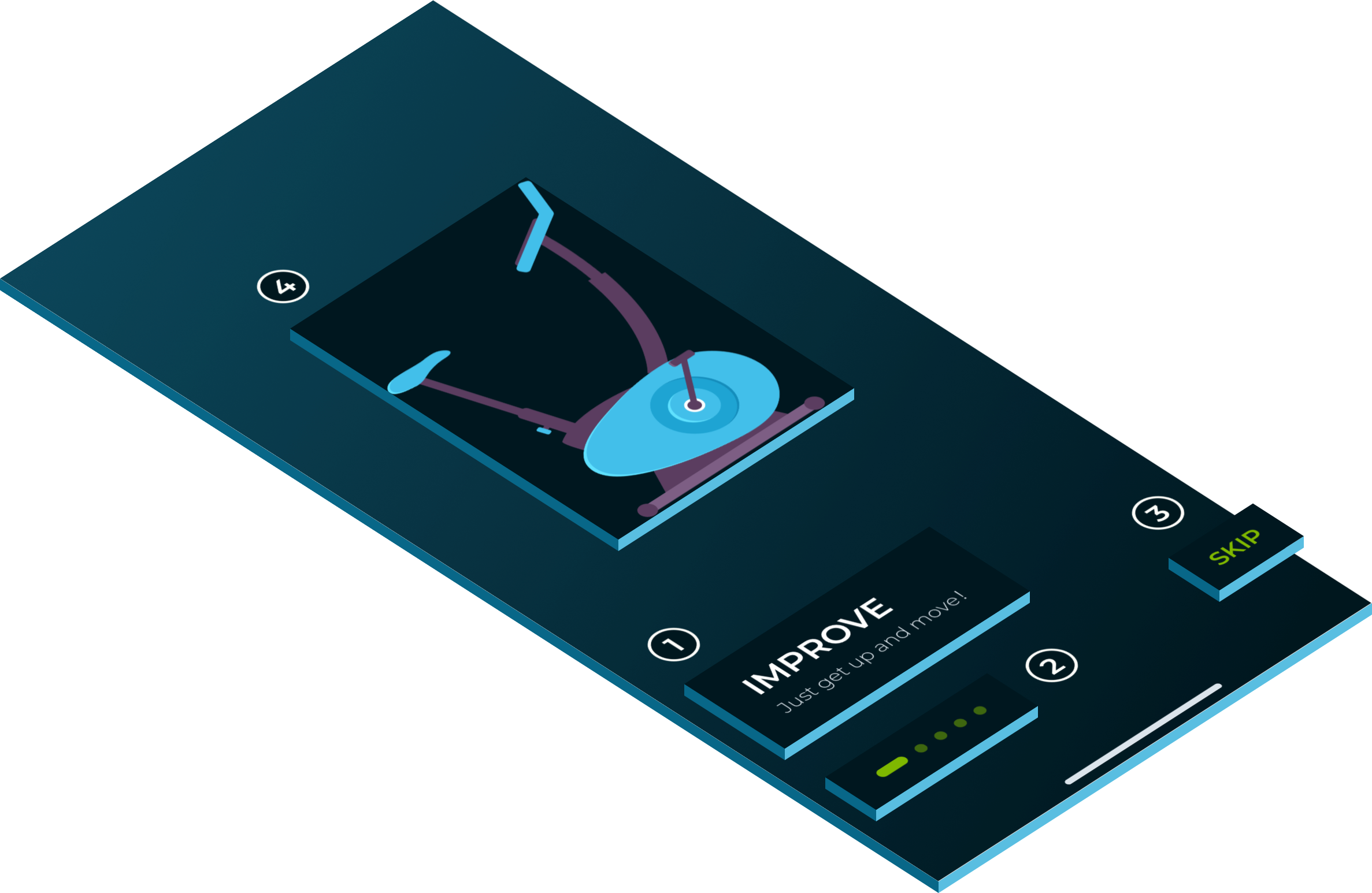
Walkthrough
Read the Medium article on how to build this Walkthrough
- MUHeader
- MUPageControl
- MUButton
- MUHorizontalPager
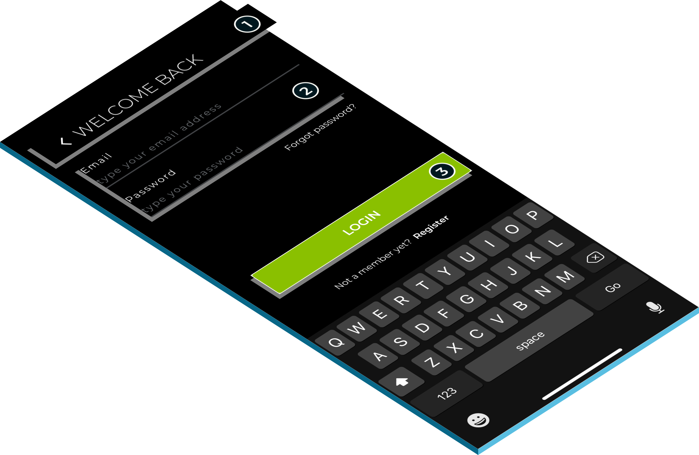
Login
- MUTopBar
- MUTextField
- MUButton
Sketch template
To help you design applications using Sejima components in Sketch we provide a Sketch template with all our components available in Symbols.
Contributing
Please read our Contributing Guide before submitting a Pull Request to the project.
Support
For more information on the upcoming version, please take a look to our ROADMAP.
Community support
For general help using Strapi, please refer to the official Sejima documentation. For additional help, you can use one of this channel to ask question:
- StackOverflow
- Slack (highly recommended for faster support)
- GitHub.
Professional support
We provide a full range of solutions to get better and faster results. We’re always looking for the next challenge: consulting, training, develop mobile and web solution, etc.
Drop us an email to see how we can help you.
License
Folding cell is released under the MIT license. See LICENSE for details.
If you use the open-source library in your project, please make sure to credit and backlink to www.moveupwards.dev